An Oil Story in 3 Pictures
June 18, 2021


You ever look at a few pictures and then shoulder shrug? That the magnitude of what you’re seeing seems significant, but obviously the market’s either not seeing it, or sees it but thinks different? Let’s take a gander at three pictures related to oil today. Here’s the first.

This chart is courtesy of Rystad, and the key takeaway? 27%.
That’s the amount of capex that we’ve cut from global upstream investment in the past two years. Prior to our COVID pandemic, global demand was approximately 100M bpd. 100 million . . . barrels . . . per . . . day.
Each year, the world spends about $500B to make sure the seemingly bottomless milkshake of oil we’re drinking doesn’t end (a figure we’d contend was already unsustainably low as it was down from +$600B pre-2015). Yet in 2020 and 2021, we’ve spent $300B or 27% less.
Let that sink in. Capex spending is used to stem decline rates. Since oil fields and wells lose pressure as oil flows out, the industry needs to continuously spend capex to preserve or increase the level of production (i.e., either artificially boosting the pressure, drilling new wells, or finding new reservoirs). A drop of 27% means less funding for drilling, less exploration, less infrastructure development, less leasing, less of everything. In a bit of symmetry it’s translated to a near 28% fall in rig counts.

In a “normal” year, we usually have enough oil to slake our thirst, and have an insurance buffer of 1-2M bpd. So a spare capacity of 1-2%, which keeps oil prices in check. Yet, that’s only possible if capex spending keeps pace, and again that level is about $500-600B a year. A 27% decline? That’s not even close, which really means we’re just beginning to see the effects. We already see it in unconventional oil (i.e., shale/tight oil), who’s quick to come online, but equally quick to fall-back when drilling stops. Already a 2M bpd loss in production there. What comes next is conventional fields.
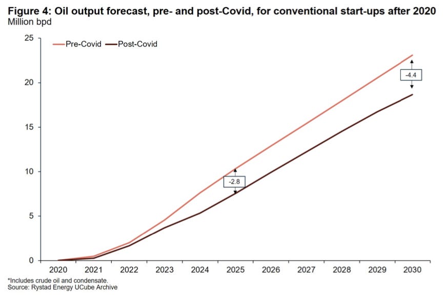
The slower flowing fields that underpin global production. Those don’t fall as fast, but they will fall faster, and it will become more apparent as the days go on, call it anywhere between 2-4M bpd in the coming years. Note that number, particularly since we’ve said that global spare capacity pre-COVID was 1-2% of a 100M bpd addiction.
Sure demand is down today, so maybe the above doesn’t matter. We don’t need those supplies in the short run right? Well, here’s the second picture.
Global inventories.

Despite our low demand, inventories appear to be drawing. Moreover, it’s drawing as India battled another wave of COVID, OPEC+ began increasing production, and Asia experienced another COVID flare-up.
Beneath the chop on the sea, the world was recovering. The recent recovery has been concentrated in North America and Europe, but that recovery will now lift Asia, and as we noted recently, that recovery will occur in Q3. Why? Vaccines. The snowball of vaccines will now makes its way to Asia.

Well surely that can’t be right . . . right? If global inventories are drawing, then the exporters/producers of the world must be sending more barrels. OPEC+ has our backs, or Iranian smuggled oil will definitely increase, frackers, yeah frackers will drill more, or something will happen to stem the inventory draws . . . it always has.
Which brings us to our “third” picture . . . oil on the high seas.

Remember, the consumers of the world (Asia, Europe, North America) really don’t produce much of their own oil. It’s shipped to them from the producing countries, so oil on water (i.e., barrels in oil tankers making their way around the world) and floating storage (i.e., tankers parked near a port holding oil) represent the waterborne “pipeline of oil”. The lower the levels of both, the lower there’s oil “coming to a shore near you.”
At first we thought this picture was caused by a data blip. Yet after a few weeks, it’s beginning to look like a trend. Floating storage in both China and the Rest of the World (Ex-China) are declining. Oil-on-water is also similarly declining, which foretells that things (i.e., inventories) globally are getting tighter and tighter. So not only are global inventories drawing on land (picture #2 above), but also on the water (picture #3 above).
So is it supplies decreasing because of capex cuts? Production artificially lowered by voluntary OPEC+ cuts? Supply restraint stemming from ESG/climate change activists taking board seats at a major oil company (Exxon), winning climate change cases in the Netherlands (Shell), convincing governments to curtail drilling on federal land (White House), and nudging international agencies and financial institutions to pivot their views on carbon emission (IEA/Net Zero/Wall Street)? Maybe.
Perhaps it’s really demand increasing because of COVID recovery, or that people are shunning public transportation and traveling in their own personal post-COVID bubbles? Could be. Whatever the reason, the mosaic is becoming clearer. It’s only three pictures, but what we’re seeing are the consequences of our actions. Global inventories, land and sea, are drawing, and that will likely continue. If so, as barrels fall, prices rise.
We’ll let Goldman have the last word on that . . .