When the Intern Takes Over.
July 1, 2022
We have an intern this summer.
Ramya Sridhar.
Say “Hi” Ramya.
Hello!
Bright eyed, bushy tailed, and eager to learn, she’s currently an undergraduate at the University of California, Berkeley. Go Bears!
She’s a ninja poet, or so her resume says. Not in so many words, but in activities. Editor of this, martial arts medalist in that, she mentally and physically squashes opponents, scary stuff. Much more mature and accomplished than I was at the same age, I think she’s a polymath in training since her brain likes to jump around a bit.
We’ll see. Young kids and all, who knows what she’ll be when she grows-up.
Firefighter or President. Maybe President.
For now, she’s an economics major. The dismal science. We’ll try to disabuse her of that venture, we still have time. 5 weeks to be precise.
We should preface everything with a tidbit. Our internships are tough. There’s a lot of information and a lot of base knowledge that gets thrown at our younglings. It’s designed to give our analysts in training some basic mental frameworks for how to think about the world, economically, financially, and politically. It covers the fundamentals, how does inflation/economic cycles work, the impact of debt/credit in the world, drivers of inflation, inflation’s affect on interest rates, interest rates’ impact on asset classes, asset class returns, and “the game within the game.” All of that. It’s hard. It’s supposed to be hard. What say you the OG of polymaths? Charlie Munger.
“It’s not supposed to be easy. Anyone who finds it easy is stupid.”
Yup. It’s supposed to be hard because this is a zero sum game. For every winner in the market, there has to be a loser. Someone has to sell you something that’s unappreciated, and if you’re right, under-appreciated. Figuring out whether it’s rightly the latter or not is tough. So we inundate our interns. They read a lot, hopefully they think a lot, and they dive through/manipulate data a lot, and maybe in those mountains of data, they can find a gem.
So we’ve just crossed the 6 weeks mark and it’s been a . . . well I’ll let her describe it.
Thank you, Nelson. It’s definitely been an experience! I’ve been staring at dense data sets for so long that I’ve begun to feel a certain way about numbers as a whole. Mostly though, I’ve been focused on answering three fundamental questions—what is happening, what are people saying, and what do we suspect will happen economically and financially in the markets? The challenge is that we have to avoid over-speculation and the inherent dangers that come with forecasting. It’s a thin line between analysis and journalism / numbers and narrative, one I am still learning to be wary of.
So what’ve you been working on?
I’ve been working with the Consumer Price Index (“CPI”) data, which is basically the bread basket of the average American consumer. Normally, CPI is reported like this. A monolithic top-line figure, for instance, 8.6% in May. Core CPI was 6.02% after we strip out food and energy.
Those numbers are numbers, but tough to understand in a vacuum. Instead, I reorganized/recategorized the CPI data into a more interpretable way . . . let me illustrate.
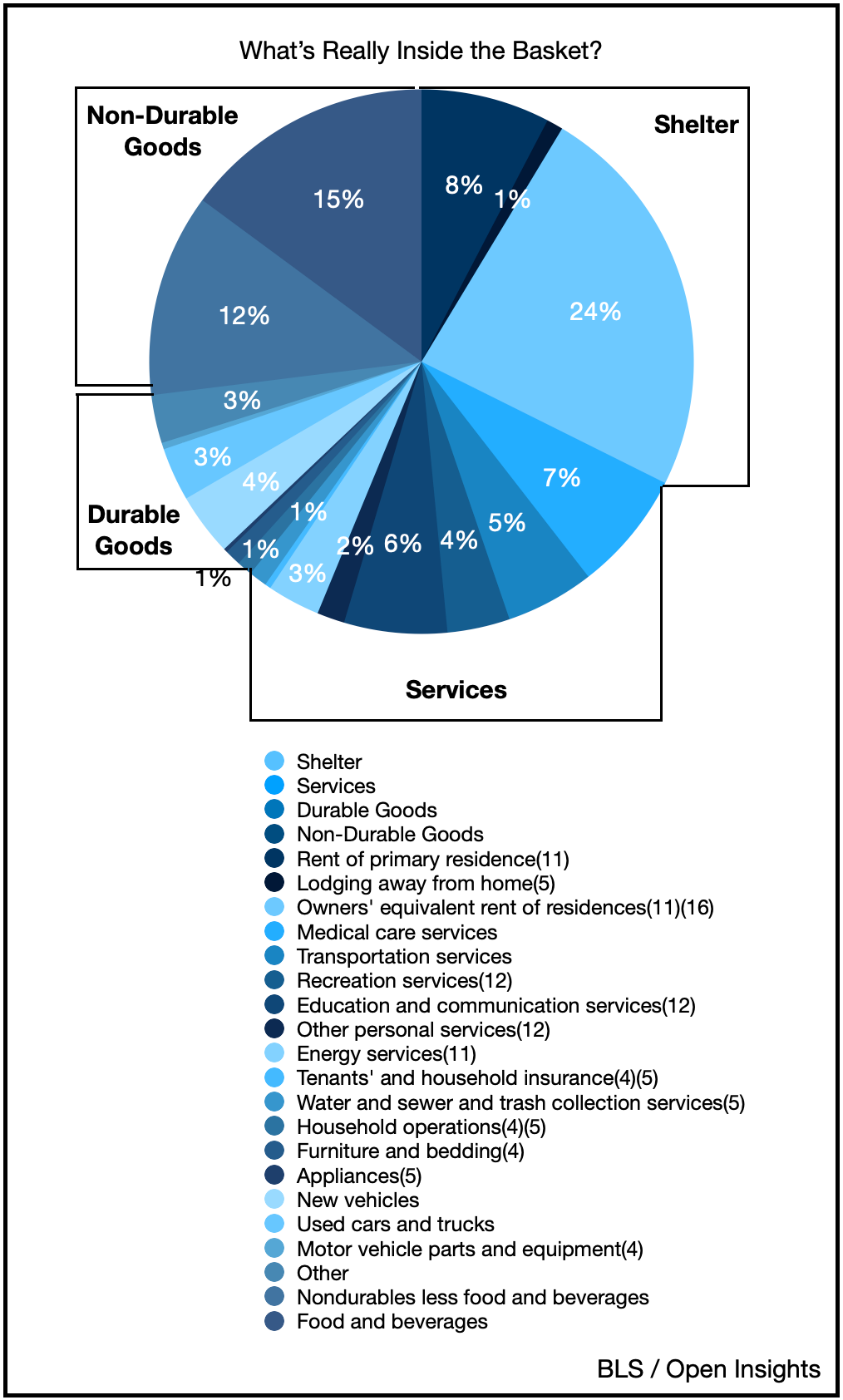
I reworked the data into four, simpler categories (Durable Goods, Non-durable goods, Shelter, and Services).
I further divided the four categories into 25 subcategories to really find out what’s inside the baskets.
After that, I researched CPI methodology, to understand how the Bureau of Labor Statistics (“BLS”) calculates each figure, and then utilized those figures to find each items’ contribution to the CPI. The task involved whittling down large sections of data, which ultimately helped with conceptualizing where inflation is actually hitting.
So what did you find?
If there was one thing I learned for sure, it’s this—CPI is important. Also, CPI is complicated, but by reorganizing the data, we can clearly see some different drivers for why inflation looks to be ramping higher.
Each category functions like a compartment in a picnic basket—they’re all sized differently based on the BLS’ methodology. Therefore, their contributions to actual inflation (e.g., the 8.6% May figure) are different, based on both their relative importance in the CPI bread basket as well as the year-over-year price movement of each individual item. After all, in an inflationary environment, prices don’t move uniformly for everything. Items that have greater weighting in the index can drive the CPI figure higher when prices in that section of the basket go up.
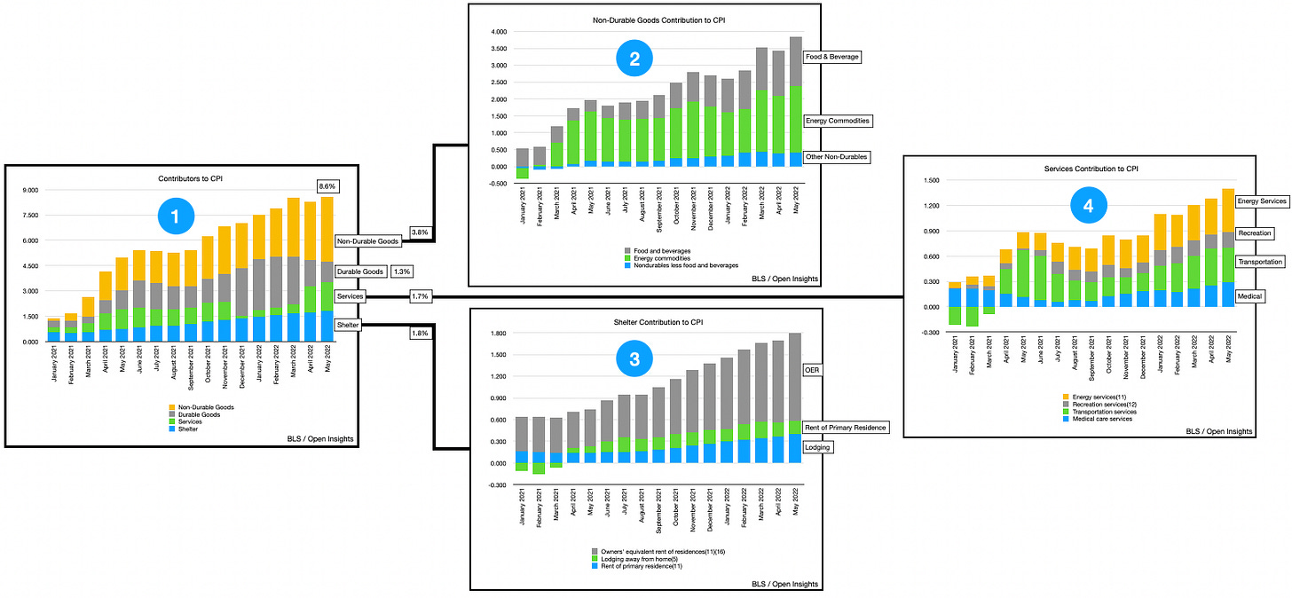
So, in the current environment, which subcategories were contributing most to CPI? Well let’s use 4 dots.
First, recall that we separated the basket into 4 categories (i.e., Durable Goods, Non-durable Goods, Shelter, and Services), then got more granular with 25 subcategories. What’s apparent is that the contribution of Durable Goods (i.e., new/used autos, appliances, things that last longer than three years) shrunk, nearly 80% of what you’re seeing from an inflation perspective is coming from the other three categories. So while new/used car prices are important, they aren’t necessarily material when compared to the other three categories.
Second, Non-durable Goods are by far the largest drivers of inflation today (specifically food and energy). Third, for Shelter, the key driver is owners equivalent rent, a proxy the BLS uses for home prices. Fourth and lastly, Services are increasingly contributing to inflation, but the individual drivers are more or less proportional.
So why’s this important?
If you know who’s driving the car, you just might know where the car is going. After I identified the key drivers of inflation, we began searching for real time indicators that can help us anticipate where inflation is heading for each of these important subcategories.
Find anything interesting? Hmmmmm????
We think we’ve uncovered a few real time proxies to forecast where 80% of the basket is headed. Some of these proxies appear to give us a few months of lead-time, while others like food and energy are more contemporaneous. Fortunately we understand energy well given the fund’s investments in the space, so we can extend our visibility there despite the real time indicators providing only a smaller window. Overall what we’re seeing is this . . .
Let me interrupt for a second, before you show the graphs. If the graph shows 2% for energy, for example, then energy contributed 2% to the overall 8.6% of May’s CPI figure (i.e., almost a quarter of the 8.6% movement in May). Okay, back to your charts.
I think a few conclusions about each category can be made.
In the graphic above, again we’ve captured 80% of what’s in the CPI picnic basket. In general, based on our real time indicators, inflation in the Energy and Housing categories will likely continue to push upwards (particularly for Housing). In contrast, the recent dips in real time food prices may moderate inflationary pressures there. Services can be expected to fluctuate along a constant plane, neither increasing, nor decreasing materially for a bit. Ultimately, since Food and Services have a lower weighting (17% and 15%, respectively) we can likely expect to see inflation increase further since Energy and Housing are currently the biggest drivers. Overall, I think we’ll see inflation continue to trend up from its last print of 8.6%, at least for the next few months.
There’s a market call for you.
Inflation is caused by supply-demand imbalances—specifically, because either demand is too high for current supplies, or supplies are too low for the current level of demand. In order to dampen demand, the Federal Reserve has embarked on a path to increase interest rates, which hypothetically should rein in inflation by lowering demand, thus mitigating the imbalances and allowing prices to fall.
Yet, isn’t this a supply issue? Won’t years of underinvestment in the commodity space, followed by Russia’s invasion of Ukraine have further consequences? While Russian oil exports have yet to decline, the tightening sanctions may raise the cost of energy in the coming months. Additionally, since Ukraine is the fourth-largest exporter of corn and the fifth-largest exporter of wheat in the world, it makes sense that the war would affect global food supply. So, two inelastic goods (energy and food) are facing potentially serious supply shortages (even without the war), resulting in cost-push inflation that increases the price of the picnic basket.
Dang girl . . . rant.
The Fed’s response? Increase interest rates! But interest rates only work to curb inflation because they curb demand. It doesn’t help the supply issues, because again, gas and food are inelastic goods. So what we see now is a pessimistic, downtrodden consumer base, paying high prices for basic necessities in an inflationary environment.
I don’t want to sound too bleak. I actually do believe things will get better, eventually.
It’ll just take time.
🤯🤯🤯
Okay, okay, whoa. Please climb down from the table now. Let’s bring it back shall we? So here’s the takeaway for inflation.
We’re tracking it.
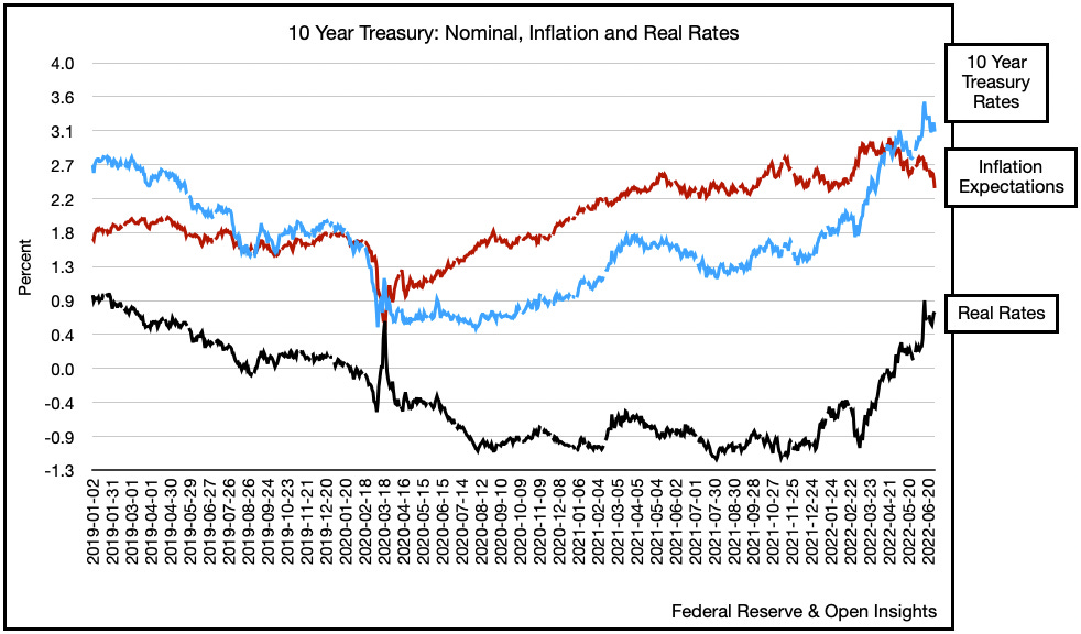
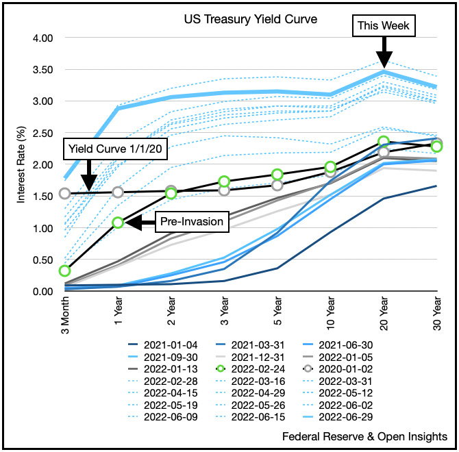
We think we have a methodology than may anticipate it, thanks to Ramya’s hard work, so we’ll see how the figures play out in the coming months. For now, we anticipate inflation to come in higher for the next few reports, then moderate thereafter. The market has already anticipated that the Fed will get ahead of the problem, hence inflation expectations have begun to plummet and interest rates have started declining. You can see it here (e.g., 10 year TIPS/inflation expectations . . .
. . . and the treasury yield curve).
Clearly the market is moving ahead here and thinks the Fed has this all under control. Ramya and I are here asking . . . what if it never was? What if inflation figures flatten out only temporarily before structural shortages come back to increase prices despite the Fed’s efforts to curb demand? That our dear readers would be “troubling” for investor expectations and market reality. The market may ignore the next few inflation reports, thinking that we’ve hit peak inflation, but if prices decline it’ll spur demand, thereby creating another imbalance. Said another way, we’re in for a period where the structural shortages mean we’ll have bouts of higher and lower inflation. Not exactly the smoothest of landings or economic cycles.
Ramya’s optimistic though, so fear not . . . but like she said . . . this’ll just take time.
Interns these days . . . just a ray of sunshine.
Now get down from the table please.
Please hit the “like” button below if you enjoyed reading the article, thank you.


Hire her.
Most impressive! If you don't offer her a job I will open up a firm just to hire her!